Twelve-year-old Viky wrote a great authentic report from a Cleverlance graphic design course for children
1st lesson
At the very beginning of the 1st lesson we introduced ourselves to the others as we do in other courses, but we also said what we wanted to learn. Once we had introduced ourselves, the lesson could begin. First they told us the colour of the year (which is called Very Peri) and how important it is for the designer. Actually, the designer uses the colour of the year almost everywhere. We also talked about the colour wheel, where you can see the contrast of colours beautifully. Then we learnt about the history of colours. It is very interesting that they were already using white paint in prehistoric times, because white is difficult to get and you even need the help of some chemicals to get it. And the Romans,for example, liked different shades of brown, so it was a romantic sort of style. Another topic was pigment. Depending on the binder you put in the pigment, different colours are produced. In the past, honey, oil or egg was used as a binder. For example, if you put honey in the pigment as a binder, you get watercolours or the same thing but with an egg, you get poster paints. The last topic was which different stones are used to make different colours. For example, yellow is made from volcanic stone or interestingly, white is made from black stone, although there is some chemical treatment, but that’s beside the point. At the end of the lesson, we were given “homework” to come up with our own colour palette for the next week. I enjoyed it very much and look forward to more graphic design lessons.
2nd lesson
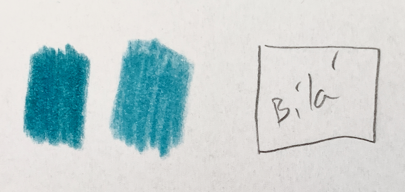
In in the 2nd lesson we talked about typography. First we discussed the history of writing. The very first writing was hieroglyphics, which were invented in Egypt.This kind of writing was time-consuming. Imagine if you had to draw a duck just to write a single word. Another type of lettering was invented by the Phoenicians and it was the first syllabic script, and from it came the Roman alphabet which we still write with today. One of the second to last topics was explaining what serif and sans serif fonts are and I am writing with sans serif at the moment. Also what uppercase and lowercase letters are. And the second to last thing we did was that they explained poster fonts and the ones they use in newspapers and so on. Poster fonts are meant to catch the eye and make an impression, but sometimes they are almost illegible. On the other hand, journalistic fonts must be easy to read. The last thing we did was that they sent us a link to a website chat room. We were able to practice placement of letters in headings and so on there. Like last time, we were given “homework” but this time we had to draw or paint our name (see picture in the header of the article). Again, like last time, I really enjoyed it and I’m looking forward to the next one.
3rd lesson
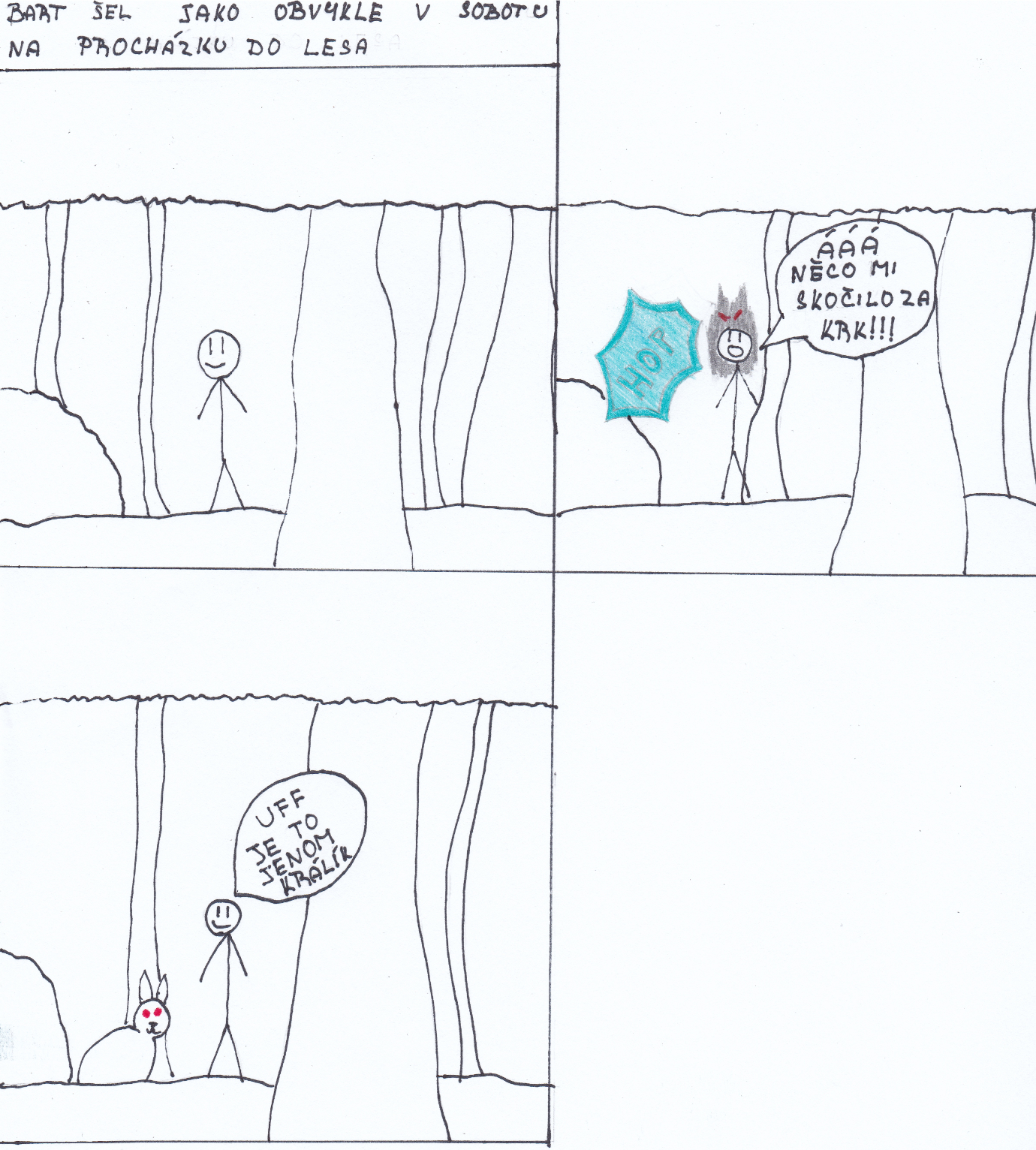
In the 3rd lesson we were dealt with comics. The very first topic we discussed was those sort of panels and we said that these panels can be arranged in different ways to keep the reader interested. Then there is that sort of shading in black and white comics, where for example the 1st panel is grey, the 2nd and 3rd panel is white and so on. Sometime around the middle of the lesson, we tried to draw our own comics, but just a strip. That means a comic with two or three panels. As soon as we had finished our “comic” the lesson was over. I enjoyed it a lot and look forward to the next one.
4Th lesson
In the 4th lesson we painted and invented our own bag of sweets. First we had to come up with a name, I came up with “Japonky”. Then the font style and when the pencil sketch was ready, we came up with a colour palette. Once we had coloured the name, we did a design like an image of the flavour: watermelon, marshmallows, etc. with leaves around it or something else. We also had to put how much it weighs and what flavour it is (just in case). While we were doing this, Michal and Ivana told us about contrast and the golden ratio. We showed them our bags of sweets at the end of the lesson. They complimented us and told us to make an interesting background and take a picture of it for them. Like each and every graphic design class, I enjoyed it, plus we got to practice typography and choosing colours which go together in this one.
In the 5th lesson we worked with Figma. We redid the bag of sweets we did last time on a computer. First we set the paper format and set the colour. Then we did the headline and edited it. We also put in different shapes there and we found different vector images on a website. We were supposed to have it finished and sent by next week. The person who had the nicest one gets a bag of sweets. All of the graphic design lessons were great and I probably enjoyed the 3rd lesson the most. If there were more, I would definitely join in.
Stay tuned for graphic designs created by the other people who took part in the course in the near future - because who wouldn’t want to see the best-looking bag of sweets!