Pantone Colour Institute, which has been dealing in colour predictions for over 20 years, has come up with another suprise after last year’s colourful couple. The world is changing and Pantone is not the only one to be hopeful that these change will be for the better. Very Peri became the new hue. How will Czechs perceive the periwinkle flower hue?
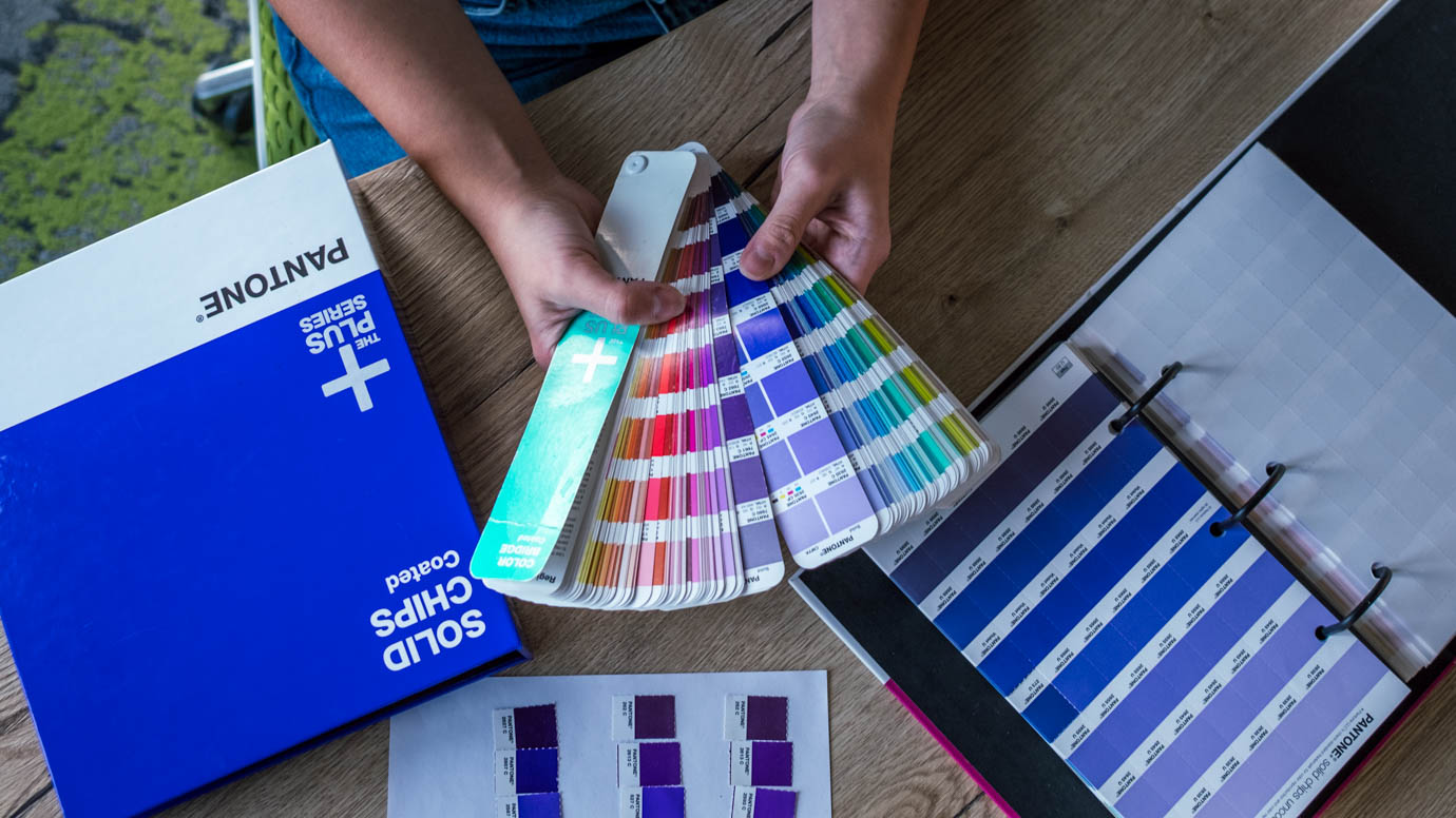
 The Pantone Colour Institute creates and manages a standardized system of colours, which includes over 2.5 thousand precisely defined hues. They are categorized based on the type of printed material (there are swatches for painted and non-painted paper, textile or plastic, as well as swatches based on types of paints – special ones for metal and shiny neon palettes and more). However, not even such an extensive library was enough to reflect the near future. For the first time in history, Pantone created a brand new hue that underlines our time of change and innovation. So far, the colour of the year was chosen from the existing palettes based on current social and cultural events.
We are living in a time full of changes, with various lockdowns and separation that led to a new perception of the world and new standards. Digital technological promises are slowly becoming reality and our limits of reality are being extended by the virtual and digital space. We are dynamically discovering new trends in the gaming industry, metaverse or digital art options via NFTs.
 This whole digital transition only accelerated the creativity at the Pantone Colour Institute, whose experts introduced a new hue called Very Peri (PANTONE 17-3938). They created a light purple hue, combining blue (symbolizing gratitude and stability) with red undertones (indicating energy, life, new possibilities and excitement about the new future). The colour of the year 2022 is supposed to strengthen our self-confidence and stimulate curiosity and creativity. Peri in the name comes from the name Periwincle - an evergreen plant with purple flowers (in the colour of Very Peri). The Czech name for the plant refers to the bright green colour and to the fact that the plant defeats winter and stays green all year long. But in English, the name Periwincle blue/violet reflects the beautiful light purple colour of its flowers.
In Western society, purple symbolizes majesty, refers to church officials and is perceived with enthusiasm. Based on a survey by STEM/MARK of 2017, it was ranked as the 5th most popular colour in the Czech Republic. Do not let the Czech name fool you and let this beautiful, vibrant colour shine in next year’s designs. At the QUB digital agency we are ready to start designing with this beautiful palette and are looking forward to original combinations with this hue. For example, what do you think about the unusual combination of the Very Peri hue with trendy khaki green? The colour of the year 2022 will look great both in dark and light mode!